
Landing pages with dark mode
By James Charlesworth
22 November 2022
See how to respond to your users' color scheme setting by displaying your landing page in dark mode, using Tailwind CSS

Dark mode is all around us. A whopping 64.6% of people expect websites to apply dark mode automatically according to recent studies, and it is no longer the reserve of the enthusiast of "power user". Enabling dark mode in the operating system is often suggested as a way to reduce fatigue and strain on your eyes. Despite all this however, in 2023 the majority of websites do not automatically switch to dark mode (including this one, for now...).
If you are creating a landing page that you really want to optimise for first impressions, then rendering your landing page in dark mode can delight and win over your visitors. This is especially true if you can switch to dark mode automatically based on the user's operating system preferences. In this article we will go over the CSS required to offer your users an automatic dark mode experience based on their operating system preferences.
Tailwind CSS Sample Project
As a base for this example we are going to use the SaaS landing page we created in Simple marketing website with tailwind CSS and React. The source code for this can be found on the traintocode GitHub and there is a live demo of this landing page deployed here.
If you want to follow along with this guide you can check out the tag tailwind-dark-mode from the repository, this commit represents the starting point for this tutorial.
https://github.com/traintocode/landing-page-react-tailwind.git

cd landing-page-react-tailwind

git checkout tailwind-dark-mode

code .
We will be adding the Tailwind CSS classes into the React component App.tsx.
Testing Dark mode in Chrome
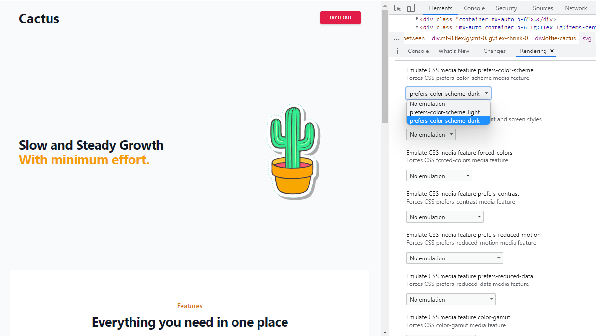
Before we begin implementing dark mode, we need to be able to easily test our web site in both light and dark styles. There is a simple way to do this in Chrome DevTools which is outlined in this StackOverflow answer but it is simple a case of opening up DevTools (F12) and hitting CTRL/COMMAND + SHIFT + P, then typing "Show rendering" to bring up the Rendering panel. From here scroll down to the Emulate CSS media feature prefers-color-scheme section and change the rendering mode.
Adding Dark Mode Utility Classes
Our landing page example uses Tailwind for the styles. Tailwind has a dark mode variant for many of its utility classes which we can use to automatically change the colours of certain elements of the page for users that have chosen dark mode.
1. Testing without the classes
Here is the app component without any dark mode utility classes present:
 App.tsx
import React, { useEffect, useRef, useState } from 'react'
import './App.css'
import Lottie, { LottieRefCurrentProps } from "lottie-react";
import cactusAnimation from "./cactus.json";

function App() {
  const lottieRef = useRef<LottieRefCurrentProps>(null);
  useEffect(() => {
    if (lottieRef.current) {
      lottieRef.current.setSpeed(0.5)
      lottieRef.current.playSegments([1, 100], true);
    }
  }, [lottieRef]);

  return <main className="bg-gray-50">
    <div className="container mx-auto p-6">

      <div className="w-full flex items-center justify-between">
        <a className="flex items-center text-gray-900 no-underline hover:no-underline font-bold text-2xl lg:text-4xl" href="#">
          Cactus
        </a>

        <div className="flex w-1/2 justify-end">
          <div className="">
            <button type="button" className="inline-block px-6 py-2.5 bg-rose-600 text-white font-medium text-xs leading-tight uppercase rounded shadow-md hover:bg-rose-700 hover:shadow-lg focus:bg-rose-700 focus:shadow-lg focus:outline-none focus:ring-0 active:bg-rose-800 active:shadow-lg transition duration-150 ease-in-out">Try It Out</button>
          </div>
        </div>
      </div>
    </div>

    <div className="mx-auto container p-6 lg:flex lg:items-center lg:justify-between">
      <h2 className="text-3xl font-bold tracking-tight text-gray-900 sm:text-4xl">
        <span className="block">Slow and Steady Growth</span>
        <span className="block text-amber-500">With minimum effort.</span>
      </h2>
      <div className="mt-8 flex lg:mt-0 lg:flex-shrink-0">
        <Lottie animationData={cactusAnimation} lottieRef={lottieRef as any} loop={false} className="lottie-cactus" />
      </div>
    </div>
  </main>
}

export default App
If you run the application and open it in your browser...
npm run dev

start http://localhost:5173/
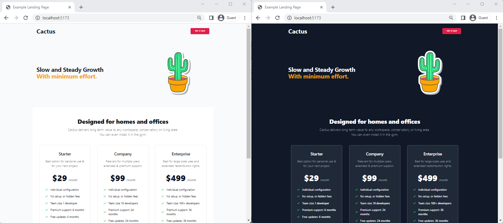
Then switch dark mode on as described earlier in Chrome's DevTools, nothing will happen. The page will continue to be shown with a white background.
2. Adding the dark background
The first utility class we can use will be dark:bg-gray-900. Add this onto the base <main> tag:
App.tsxreturn <main className="bg-gray-50 dark:bg-gray-900">
...
</main>
}
export default App
Flipping the rendering mode to prefers-color-scheme: dark with this one extra utility class will render the background in dark grey like this:
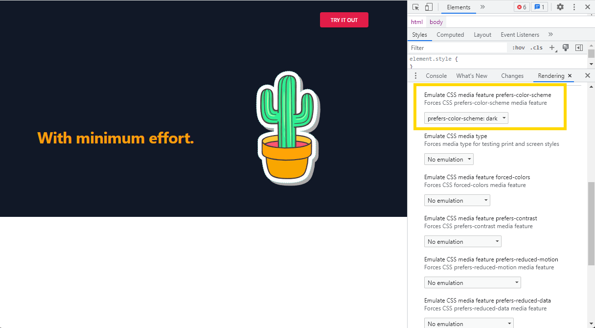
3. Adding the light text
We now have the background changing to a darker colour, but since we haven't done anything to the text, it is now completely illegible. To fix this we need to add a couple more dark:* utility classes, this time to the headings that we want to render in a lighter colour. Add the utility class dark:text-white to the class list of any text element that uses text-gray-900 in your App component:
return <main className="bg-gray-50 dark:bg-gray-900">
    <div className="container mx-auto p-6">

      <div className="w-full flex items-center justify-between">
        <a className="flex items-center text-gray-900 dark:text-white no-underline hover:no-underline font-bold text-2xl lg:text-4xl" href="#">
          Cactus
        </a>

        <div className="flex w-1/2 justify-end">
          <div className="">
            <button type="button" className="inline-block px-6 py-2.5 bg-rose-600 text-white font-medium text-xs leading-tight uppercase rounded shadow-md hover:bg-rose-700 hover:shadow-lg focus:bg-rose-700 focus:shadow-lg focus:outline-none focus:ring-0 active:bg-rose-800 active:shadow-lg transition duration-150 ease-in-out">Try It Out</button>
          </div>
        </div>
      </div>
    </div>

    <div className="mx-auto container p-6 lg:flex lg:items-center lg:justify-between">
      <h2 className="text-3xl font-bold tracking-tight text-gray-900 dark:text-white sm:text-4xl">
        <span className="block">Slow and Steady Growth</span>
        <span className="block text-amber-500">With minimum effort.</span>
      </h2>
      <div className="mt-8 flex lg:mt-0 lg:flex-shrink-0">
        <Lottie animationData={cactusAnimation} lottieRef={lottieRef as any} loop={false} className="lottie-cactus" />
      </div>
    </div>

    ...
  </main>
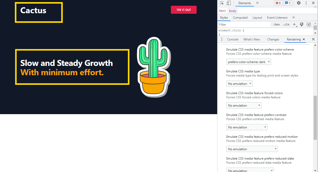
Now head back over to your chrome browser window (no need to refresh, Vite will hotload the changes automatically) and you should see the title and text field have turned to white:
Conclusion
In this article we have seen how using the dark:* utility classes in Tailwind CSS can automatically change the colour of elements of your landing page to respect a user's operating system preferences. The other blocks we added in Simple marketing website with tailwind CSS and React were taken from Flowbite and already have the dark:* utility classes applied.
The full source code for this landing page can be found here: github.com/traintocode/landing-page-react-tailwind.

Hi, I'm James
I've worked in software development for nearly 20 years, from junior engineer to Director of Engineering. I'm here to help you get your foot on the next rung of your career ladder. I post weekly videos on YouTube and publish guides, articles, and guided project tutorials on this site. Sign up to my newsletter too for monthly career tips and insights in the world of software development.
Related Project Tutorials
Read Next...
What is JavaScript Strict Mode and Why You Should Use It?
3 December 2023 • 3 min read
Explore the benefits of JavaScripts strict mode in enhancing code reliability and preventing common mistakes. This article delves into its features, real-world examples, and reasons why both beginners and pros should consider its adoption.
How to Run TypeScript in VS Code
30 November 2023 • 3 min read
Learn how to set up, run, and debug TypeScript in Visual Studio Code. This guide provides step-by-step instructions to enhance your JavaScript development process. Dive into the seamless integration of TypeScript with VSCode for a productive coding session.
First Class Functions in Javascript
17 August 2023 • 3 min read
This article introduces you to first class functions, and how functions can be treated as first class citizens in programming, demonstrating their utility and practical applications in Javascript.