
Adding Syntax Highlighting to Gatsby MDX with Prism
By James Charlesworth
1 May 2020
How to use PrismJS to add syntax highlighting to Gatsby pages

Gatsby is great and the plugin system is very widely developed, however sometimes it can be a bit tricky to get different libraries to work together. In this post we are going to look at the steps to integrate PrismJS syntax highlighting with MDX pages generated with the gatsby-plugin-mdx plugin. This is what we are going to enable:
```javascript
function myFunction() {

    const iterable = [10, 20, 30];

    for (const value of iterable) {
        console.log(value);
    }
}
``
And this will be the result
function myFunction() {

    const iterable = [10, 20, 30];

    for (const value of iterable) {
        console.log(value);
    }
}
Step 1: Add some code to your MDX
Before we add syntax highlighting let's add the javascript snippet to our MDX markup, run a gatsby build and inspect the generated HTML in your browser. You should see something like this:
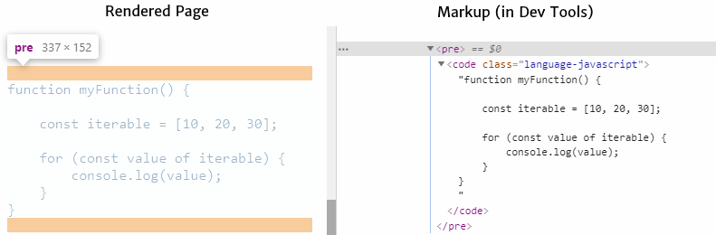
The gatsby-plugin-mdx plugin will wrap your code in a <code\> element, and then place this inside a <pre\> (for preformatted text). Also notice that gatsby-mdx will append the class name <code class="language-javascript">. This is all PrismJS needs to get to work to identify your code as Javascript (or any of the other languages that are supported out the box)
Step 2: Create a Highlight Wrapper
In order to add formatting to the <code></code> block above, we can use prism-react-renderer which nicely wraps PrismJS into a React element.
npm install prism-react-renderer
Following the docs for prism-react-renderer we can create a component in our Gatsby site to wrap the code block.
Add a new file ./src/components/CodeBlock.jsx with the following contents:
import React from 'react'
import Highlight, {defaultProps} from 'prism-react-renderer'
import theme from 'prism-react-renderer/themes/github'
import Prism from "prism-react-renderer/prism";

export default (props) => {
    const className = props.children.props.className || ''
    const matches = className.match(/language-(?<lang>.*)/)

  return (
    <Highlight {...defaultProps} code={props.children.props.children.trim()} language={
        matches && matches.groups && matches.groups.lang
          ? matches.groups.lang
          : ''
      }
      theme={theme}>
      {({className, style, tokens, getLineProps, getTokenProps}) => (
        <pre className={className} style={{...style, padding: '20px'}}>
          {tokens.map((line, i) => (
            <div key={i} {...getLineProps({line, key: i})}>
              {line.map((token, key) => (
                <span key={key} {...getTokenProps({token, key})} />
              ))}
            </div>
          ))}
        </pre>
      )}
    </Highlight>
  )
}
This is a react component that wraps our content (from props.children) with the <Highlight /> element imported from prism-react-renderer.
Step 3: Supply Wrapper Component To MDXRenderer
The final step is to tell gatsby-plugin-mdx to use our new wrapper component whenever it wants to render a <pre> element.
If you are not already, wrap your MDX in a <MDXRenderer /> component as described in the docs for gatsby-plugin-mdx/#mdxrenderer. Then we can add our new CodeBlock wrapper into the components object supplied to the <MDXProvider />
import { MDXProvider } from "@mdx-js/react"
import CodeBlock from './path/to/CodeBlock'; // The wrapper you created in step 2

const components = {
  pre: CodeBlock
}

const MdxBlock: React.FunctionComponent<Props> = (props) => {
  return <MDXProvider components={components}>
      <MDXRenderer>{props.mdx.body}</MDXRenderer>
    </MDXProvider>
}
export default MdxBlock;
And there you have it. Build and run your gatsby site with gatsby develop and open the page created from your .mdx file to see all the glories of code highlighting!

Hi, I'm James
I've worked in software development for nearly 20 years, from junior engineer to Director of Engineering. I'm here to help you get your foot on the next rung of your career ladder. I post weekly videos on YouTube and publish guides, articles, and guided project tutorials on this site. Sign up to my newsletter too for monthly career tips and insights in the world of software development.
Related Project Tutorials
Read Next...
What is JavaScript Strict Mode and Why You Should Use It?
3 December 2023 • 3 min read
Explore the benefits of JavaScripts strict mode in enhancing code reliability and preventing common mistakes. This article delves into its features, real-world examples, and reasons why both beginners and pros should consider its adoption.
How to Run TypeScript in VS Code
30 November 2023 • 3 min read
Learn how to set up, run, and debug TypeScript in Visual Studio Code. This guide provides step-by-step instructions to enhance your JavaScript development process. Dive into the seamless integration of TypeScript with VSCode for a productive coding session.
First Class Functions in Javascript
17 August 2023 • 3 min read
This article introduces you to first class functions, and how functions can be treated as first class citizens in programming, demonstrating their utility and practical applications in Javascript.